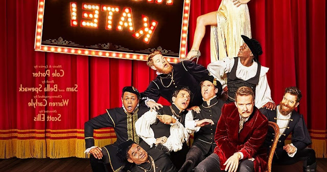
So, for a change I'll be blunt. If ever there was a show logo/advertising element that defines the idea of "phoning it in," the logo for Kiss Me, Kate the revival being presented by Roundabout Theater Company is it. It looks and feels like it was thrown together on a computer and that's that.
Probably the best thing about the logo is the beautiful shade of red they used. It is classy and elegant. And the use of marquee light letters as the title font looks good, with the askew "K" in Kate adding some visual interest. It also subtly suggests that the show is a little off, which is true of the musical. But, and please correct me if I am wrong here, very little of Kate is subtle.
The logo featuring a cast photo and some credits is interesting... was it being in reverse intentional? If so, it certainly is eye-catching that way and suggests a fun role reversal. If not, then they may want to consider using more of this. Regardless, this version requires some prior knowledge of the show - a mistake even with a famous title like this. The cleverest part of this is that Kelli O'Hara has climbed over a pile of men to get to the top of the heap (female empowerment, check), but, unless you know the show, you have no idea why Will Chase is looking like he does. (What his face is saying exactly is enigmatic to say the least.) This photo image does tell the story somewhat, but if you don't know the show, you may not get why the leads are in an evening gown and smoking jacket, while the others are in Shakespearean garb. That said, at least the background of a stage curtain suggests that we are seeing a play that knows it's a play. The bottom line here is that while it provides a lot of information, none of it is cohesive enough to make easy sense, nor is it really compelling enough to warrant more than a dismissive glance.
The best example of the logo is the marquee lights title, with just the two stars and nothing else to muddle things. Even though the pictures are clearly not taken together, but rather an obvious Photoshop job, they at least suggest a rivalry/battle of the sexes, which is what the show (and show-within-the-show) is about. And it also simply highlights the main attraction here, the two stars.
Like I said, though. It all just feels lazy. And it doesn't entice me to buy a ticket. I'm an easy sell, an avid fan who hates to miss anything. But I'm taking a pass on this one.
Grade: D-
#2027


No comments:
Post a Comment